Another key distinction that sets INTRIGUE apart as a full-service digital agency is our heritage in traditional print. It gives us an edge in precision and accuracy that other digital shops find difficult to rival. In this sense, we understand the goal of true-to-life imagery perhaps more than most. And we are obsessive about quality control throughout every aspect of production.
This comes from an instinctive respect and appreciation that print jobs mean additional hard costs, and there are no “do-overs” in traditional print as there are on the Web. What’s the added benefit of all this extra care and discipline? Not only exceptional print production, but the creation of digital work that reflects the same high caliber and quality.
Even though we are a full-service digital agency today, INTRIGUE brings over 25 years of experience in the print industry. Our journey began on the press floor—where ink met paper and precision met passion—and that foundation continues to inform the high standards we uphold across every project.
We’ve grown in step with technological advances, expanding our capabilities while staying true to the craftsmanship that defined our early years. Today, we continue to set ourselves apart with a full suite of innovative, high-impact print.

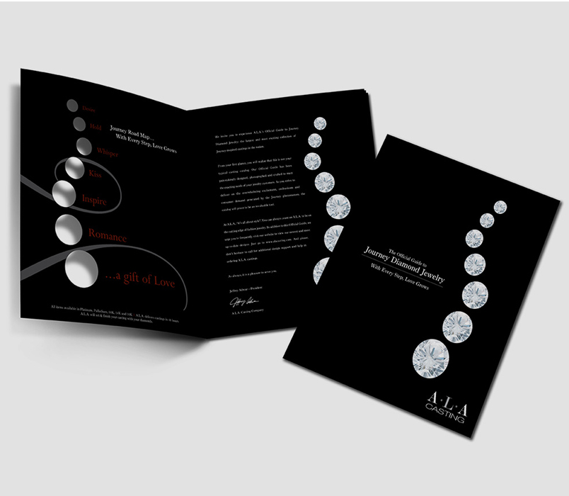
Ideal for high-quality jobs with precise color control, sheet-fed printing uses individual sheets of paper fed through the press. It’s perfect for brochures, marketing materials, high-end catalogs, and anything where sharp detail and vibrant color are essential.
Used for high-volume, high-speed print runs like large catalogs, and magazines, offset web printing utilizes continuous rolls of paper. It offers cost-efficiency at scale without compromising on quality—making it perfect for big distribution needs.
Need quick turnaround and smaller quantities? Our digital and on-demand printing services are fast, flexible, and cost-effective. Perfect for short-run marketing materials, personalized prints, or last-minute campaign needs—without sacrificing print quality.
Need quick turnaround and smaller quantities? Our digital and on-demand printing services are fast, flexible, and cost-effective. Perfect for short-run marketing materials, personalized prints, or last-minute campaign needs—without sacrificing print quality.
This comes from an instinctive respect and appreciation that print jobs mean additional hard costs, and there are no “do-overs” in traditional print as there are on the Web. What’s the added benefit of all this extra care and discipline? Not only exceptional print production, but the creation of digital work that reflects the same high caliber and quality.
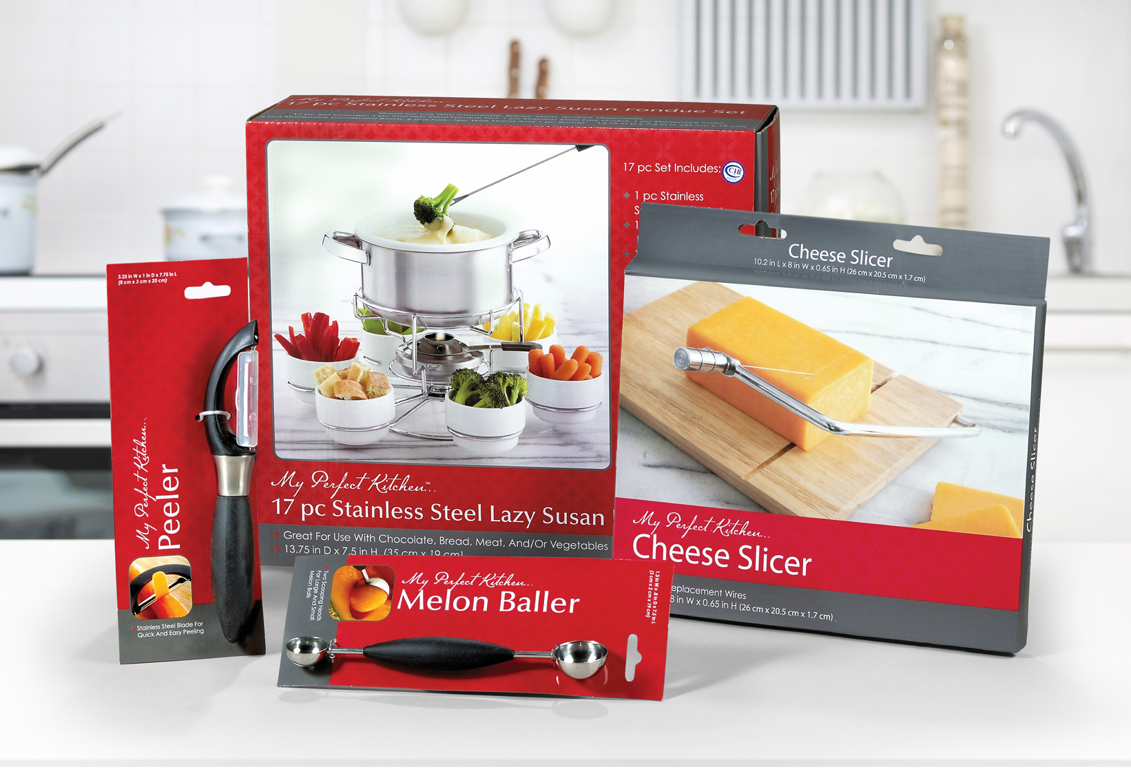
Custom boxes, labels, and product wraps that are both functional and beautiful.
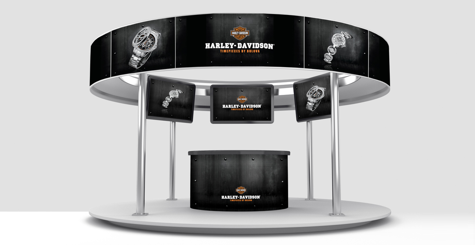
Posters, trade show displays, window graphics, vehicle wraps, and more—built to grab attention from a distance.
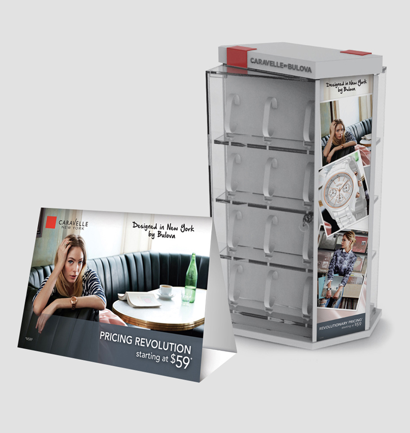
Indoor or outdoor, temporary or permanent—we make bold statements in any environment.
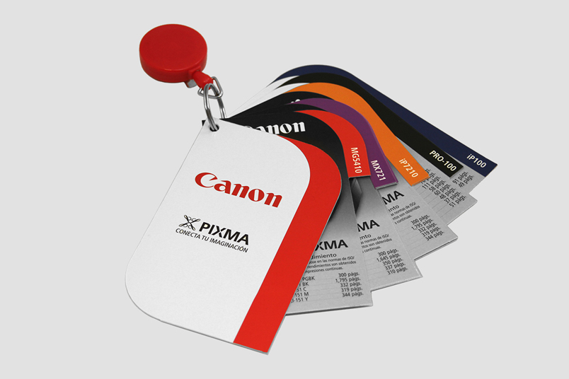
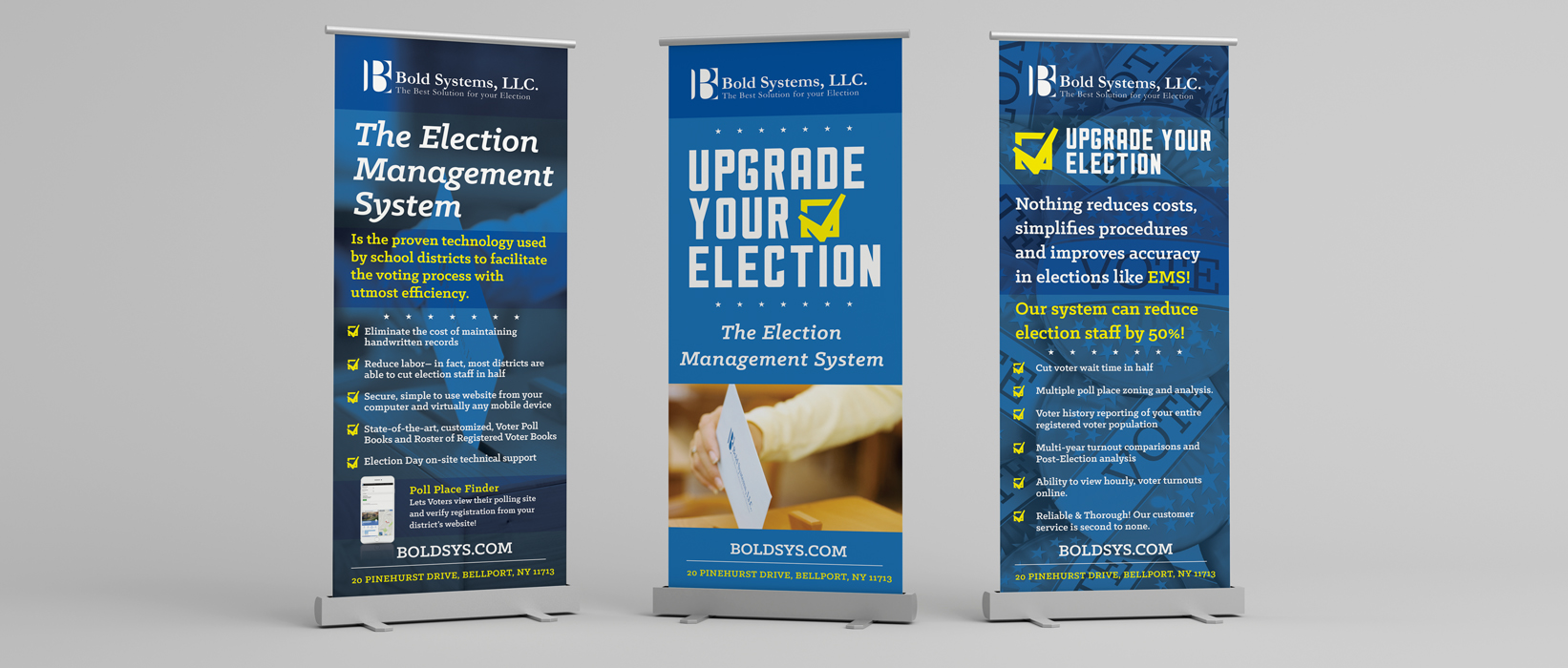
Personalized, trackable, and designed to convert.
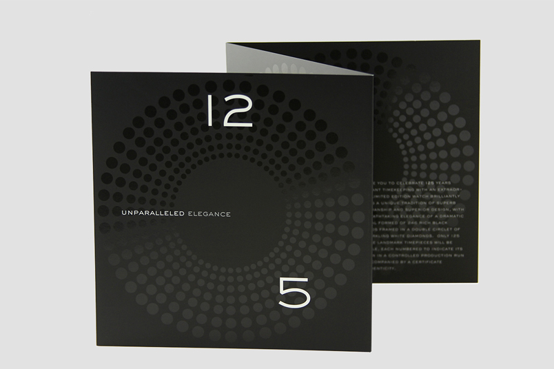
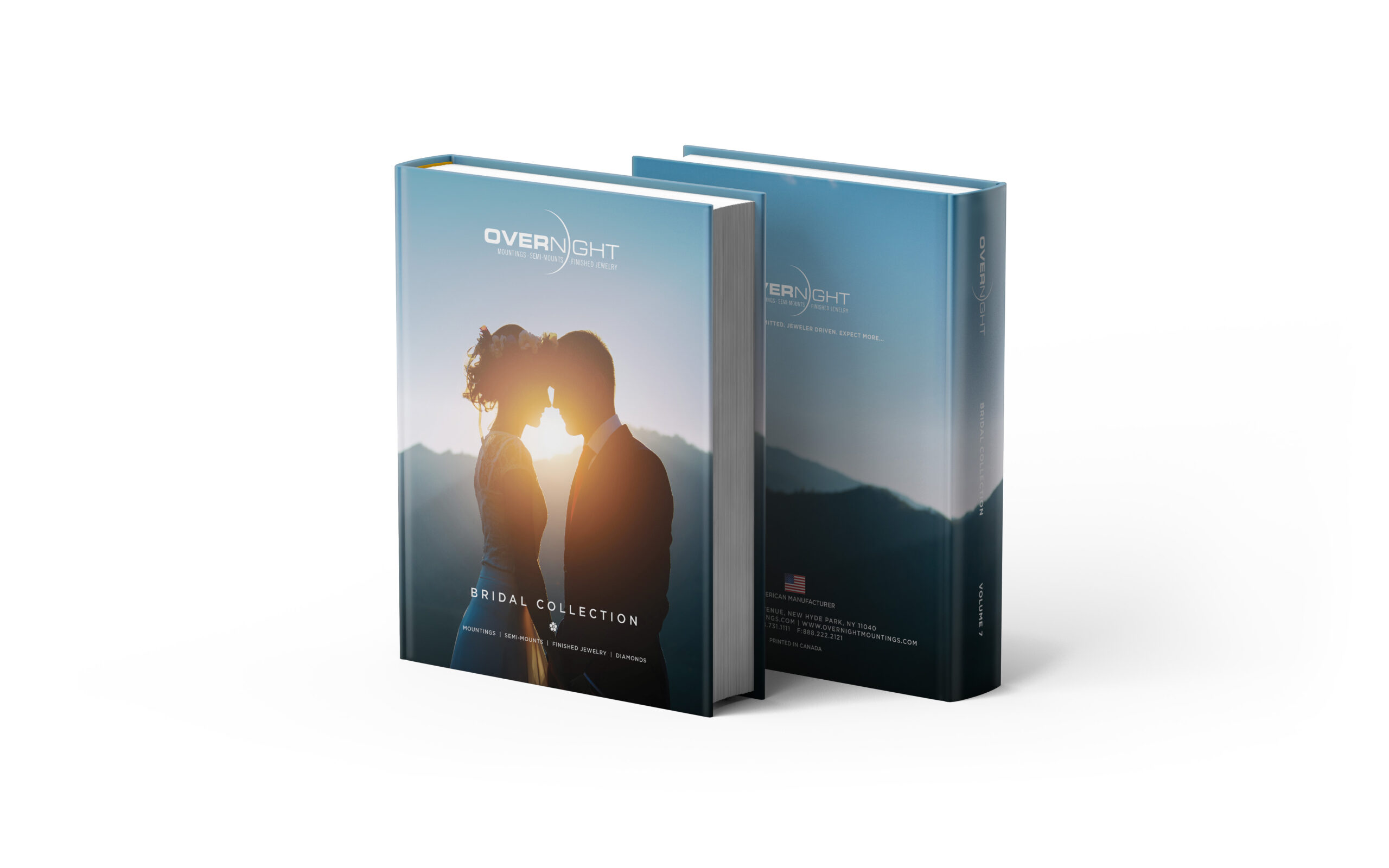
Including perfect binding, hard covers, embossing, foil stamping, die-cutting, and more for that extra professional polish.